Decision 01 · Understand the baseline
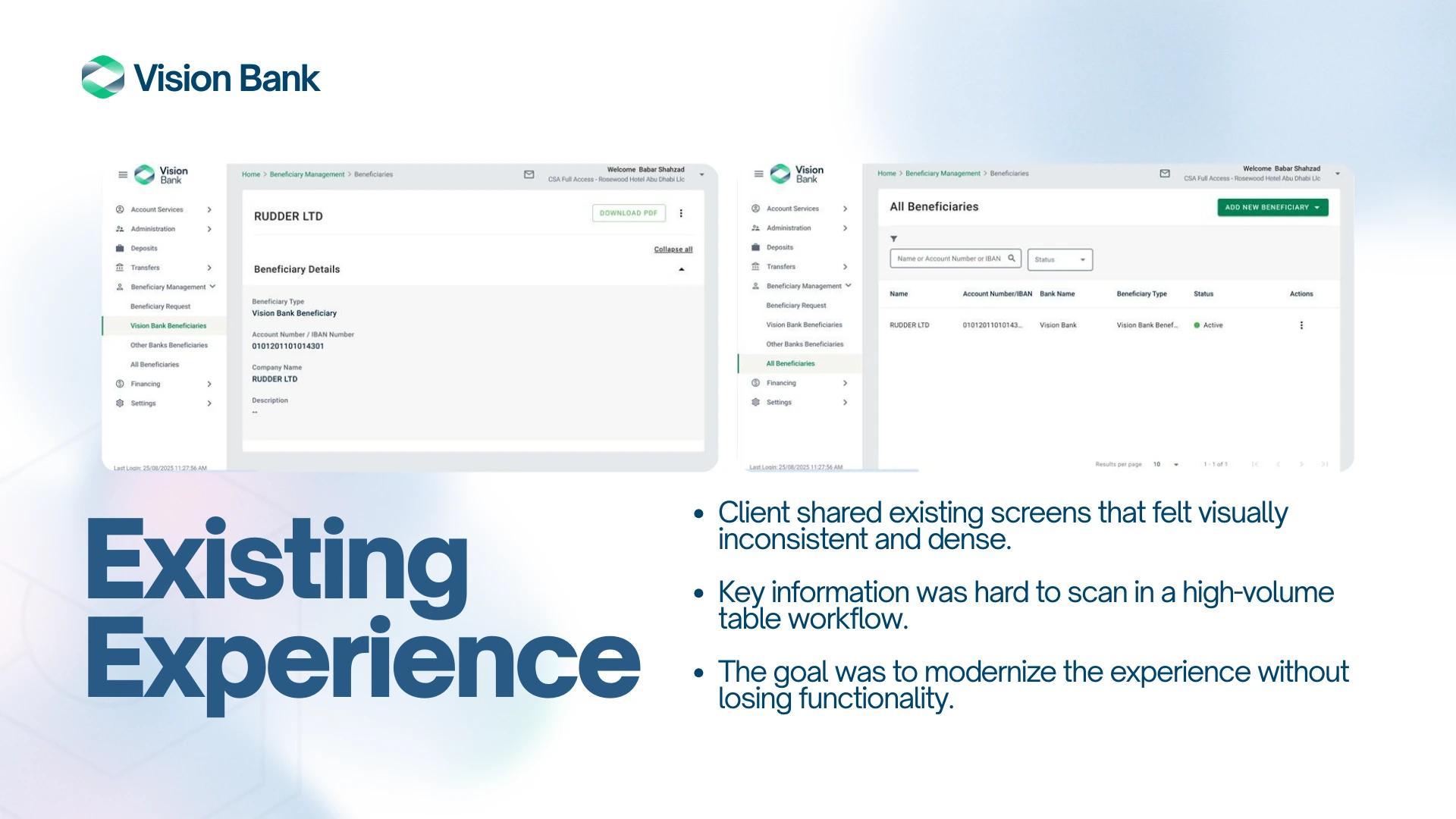
The information was there, but hard to read
Existing screens put dense records and key actions in a weak hierarchy. That set the design problem: improve scanning without dropping necessary detail.
04 / 05 · Vision Bank · Enterprise UX/UI · 2025
A beneficiary management redesign that makes dense banking records easier to scan, filter, and act on while respecting the client’s brand.
The existing beneficiary management interface was visually inconsistent and hard to scan. The redesign had to make high-volume records and actions easier to find without losing enterprise functionality.
Rework the information hierarchy so people could find, filter, and act on beneficiary records in a dense enterprise view.
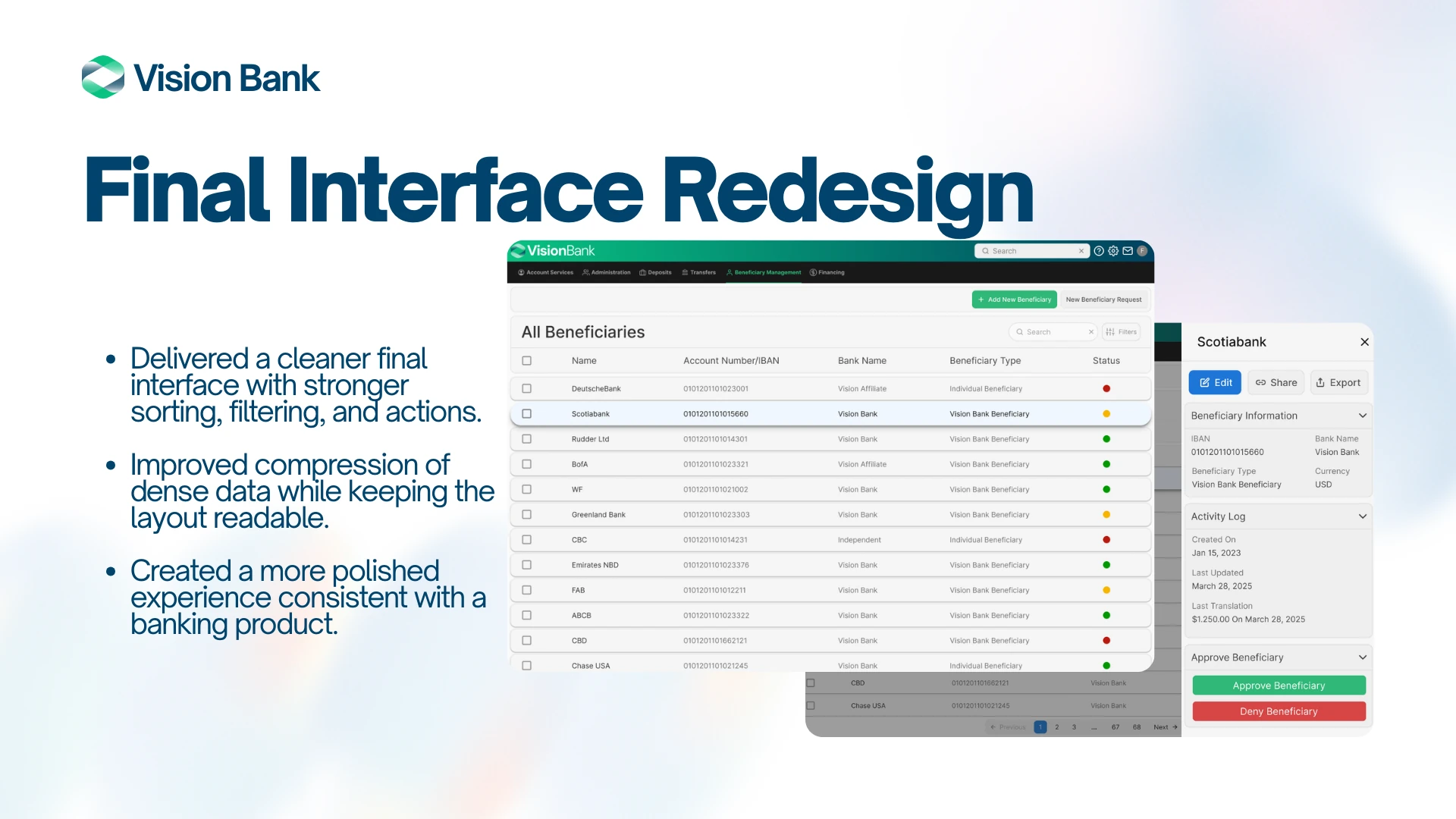
The result shown is a final proposed interface with clearer list hierarchy, filtering, and expanded details. The materials do not establish a shipped release or measured usage outcome.
Decision 01 · Understand the baseline
Existing screens put dense records and key actions in a weak hierarchy. That set the design problem: improve scanning without dropping necessary detail.
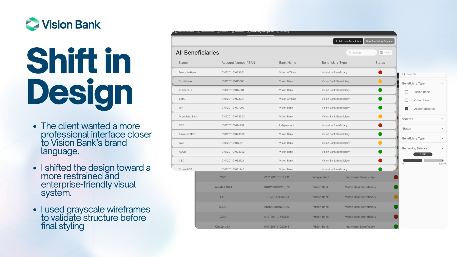
Decision 02 · Respond to feedback
The first exploration used cards and larger affordances. Client feedback called for a more professional direction, so the structure was tested in grayscale before visual refinement.
Decision 03 · Refine the proposal
The final proposed interface keeps the data view compact while making filtering and contextual detail easier to access.
5 more images from the project.