A press needs a direction.
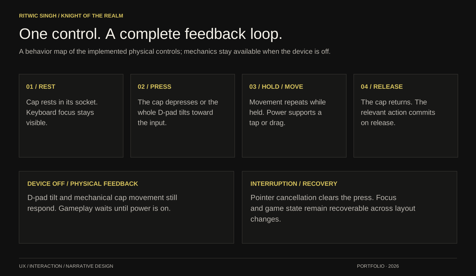
The D-pad tilts as a single piece. Separate yellow caps depress into their sockets. The D-pad also responds while the game is off.
 RITWIC SINGH
All projects
RITWIC SINGH
All projects
KNIGHT OF THE REALM / UX CASE STUDY & PLAYABLE EXPLORATION
An end-to-end UX exploration of a familiar object and an unfamiliar world. I shaped the player journey, authored the story, directed the visual language and refined the physical interactions through repeated review.
01 / EXPERIENCE THE DETAILS
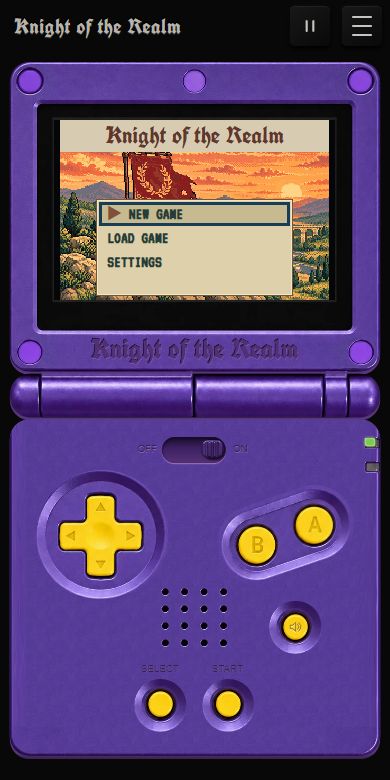
Try the D-pad while the console is off. Then slide the power switch to ON, press Start and explore. These are the working game’s controls.
Press each direction: the whole D-pad tilts toward your input, even while power is off. Once playing, hold a direction to keep moving.
After clicking inside the console, keyboard inputs control the game. Tab moves between controls and out of the embed. Reading view is available from the page menu’s Controls section and through keyboard focus in the console header. Haptic feedback depends on the browser; iPhone Safari does not provide the native haptics this design would need.
A purple frame and yellow buttons could evoke a handheld at first glance. The harder work was sustaining that impression through touch: where a button pivots, how far a cap travels, what happens on release, and how the casing rests on its background.
I used the familiar handheld form to make the controls recognizable, then refined its behavior alongside an original Roman fantasy story. Physicality, readability and consistency became the criteria for every iteration.
The D-pad tilts as a single piece. Separate yellow caps depress into their sockets. The D-pad also responds while the game is off.
A shallow molded edge and clean transparent corners give the casing thickness against the black page. The portfolio embed removes the surrounding glow.
The portrait hinge and landscape GBA silhouette use the same control behavior. Plain plastic can adapt; buttons retain their proportions and the landscape screen opening follows the game’s 3:2 ratio.
03 / PLAYER PERSONAS & EXPERIENCE GOALS
The experience asks players to trust a physical metaphor, enter an unfamiliar story and learn a small control vocabulary. I have organized those needs into three proto-personas, each connected to an explicit design response.
These are design hypotheses synthesized for this case study from the brief and review history. They are not personas validated through interviews. The questions below form a next-round research plan.
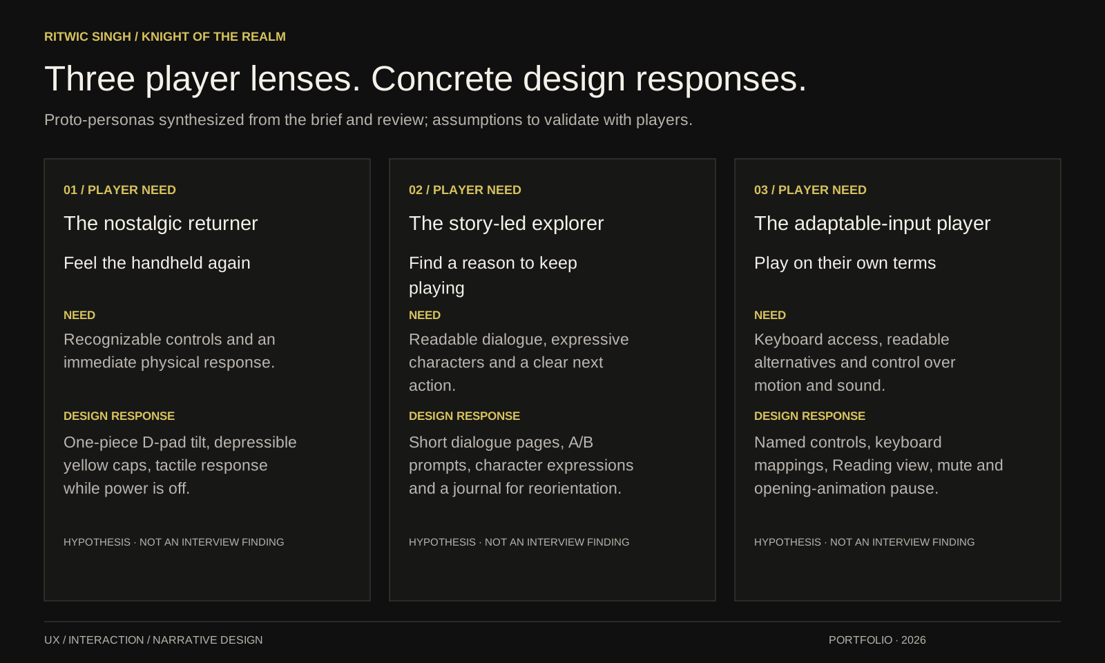
Feel the handheld again
Find a reason to keep playing
Play on their own terms
04 / JOURNEY MAPPING
I mapped the opening as a sequence of player intentions, then connected likely friction to a response in the interface. The map makes the relationship between small hardware details and the wider game experience visible.
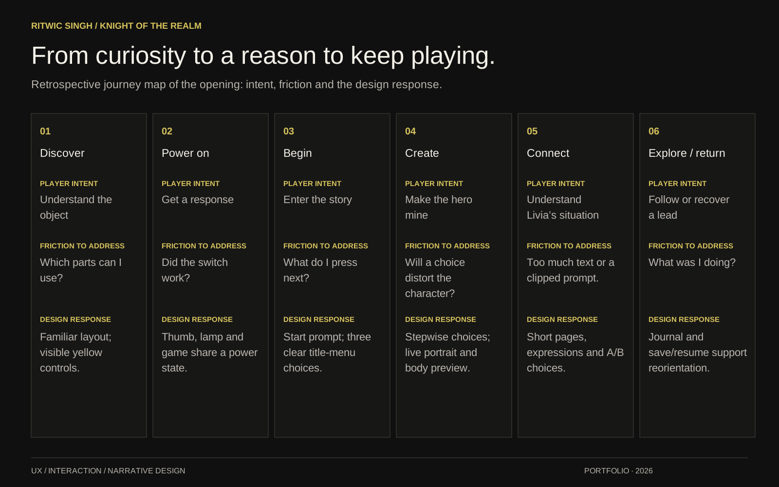
Player intent: Understand the object
Friction: Which parts can I use?
Design response: Familiar layout; visible yellow controls.
UX focus / Control recognitionPlayer intent: Get a response
Friction: Did the switch work?
Design response: Thumb, lamp and game share a power state.
UX focus / State consistencyPlayer intent: Enter the story
Friction: What do I press next?
Design response: Start prompt; three clear title-menu choices.
UX focus / Action hierarchyPlayer intent: Make the hero mine
Friction: Will a choice distort the character?
Design response: Stepwise choices; live portrait and body preview.
UX focus / Ownership and consistencyPlayer intent: Understand Livia’s situation
Friction: Too much text or a clipped prompt.
Design response: Short pages, expressions and A/B choices.
UX focus / Narrative comprehensionPlayer intent: Follow or recover a lead
Friction: What was I doing?
Design response: Journal and save/resume support reorientation.
UX focus / Recoverability05 / STORYBOARDING & NARRATIVE UX
The opening moves from recognition to agency: touch the object, power it on, enter the world, create an identity and meet someone who gives the player a reason to act. This storyboard ties the authored premise to what a player sees, does and needs next.
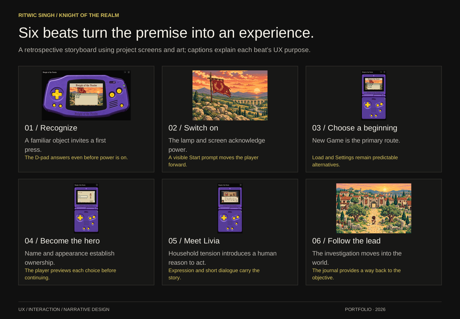
A familiar object invites a first press. The D-pad answers even before power is on.
The lamp and screen acknowledge power. A visible Start prompt moves the player forward.
New Game is the primary route. Load and Settings remain predictable alternatives.
Name and appearance establish ownership. The player previews each choice before continuing.
Household tension introduces a human reason to act. Expression and short dialogue carry the story.
The investigation moves into the world. The journal provides a way back to the objective.
06 / INFORMATION ARCHITECTURE & INTERACTION DESIGN
The console is a small interaction system. Gameplay, progress and page utilities need distinct entry points; each physical control also needs a complete response across press, hold, release and interruption.
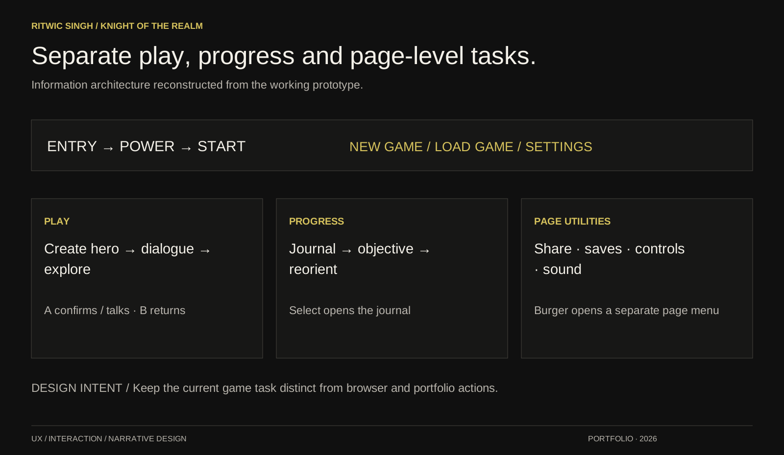
Entry → Power → Start → New Game, Load Game or Settings. New Game leads through creation, dialogue and exploration. A confirms or talks; B returns. Select opens the journal to restore the current objective. The separate page drawer contains share, save download, controls, sound, feedback and version information.
With power off, mechanical cap and D-pad responses remain available. Gameplay waits until power is on. A layout change preserves the current game session.
Raised yellow caps signal touch. Travel, tilt, the power lamp and the changing game screen acknowledge different actions. Sound can be muted without losing the visual response.
Thumb, lamp and display communicate one power state. Portrait and landscape share the input behavior. Buttons keep their proportions while the plain shell and screen opening adapt.
Back reverses a choice; the journal restores context. Pressed controls reset on cancellation, and the drawer returns focus to its opener. The close control occupies the burger’s location.
07 / NOTICE → CHANGE → CHECK
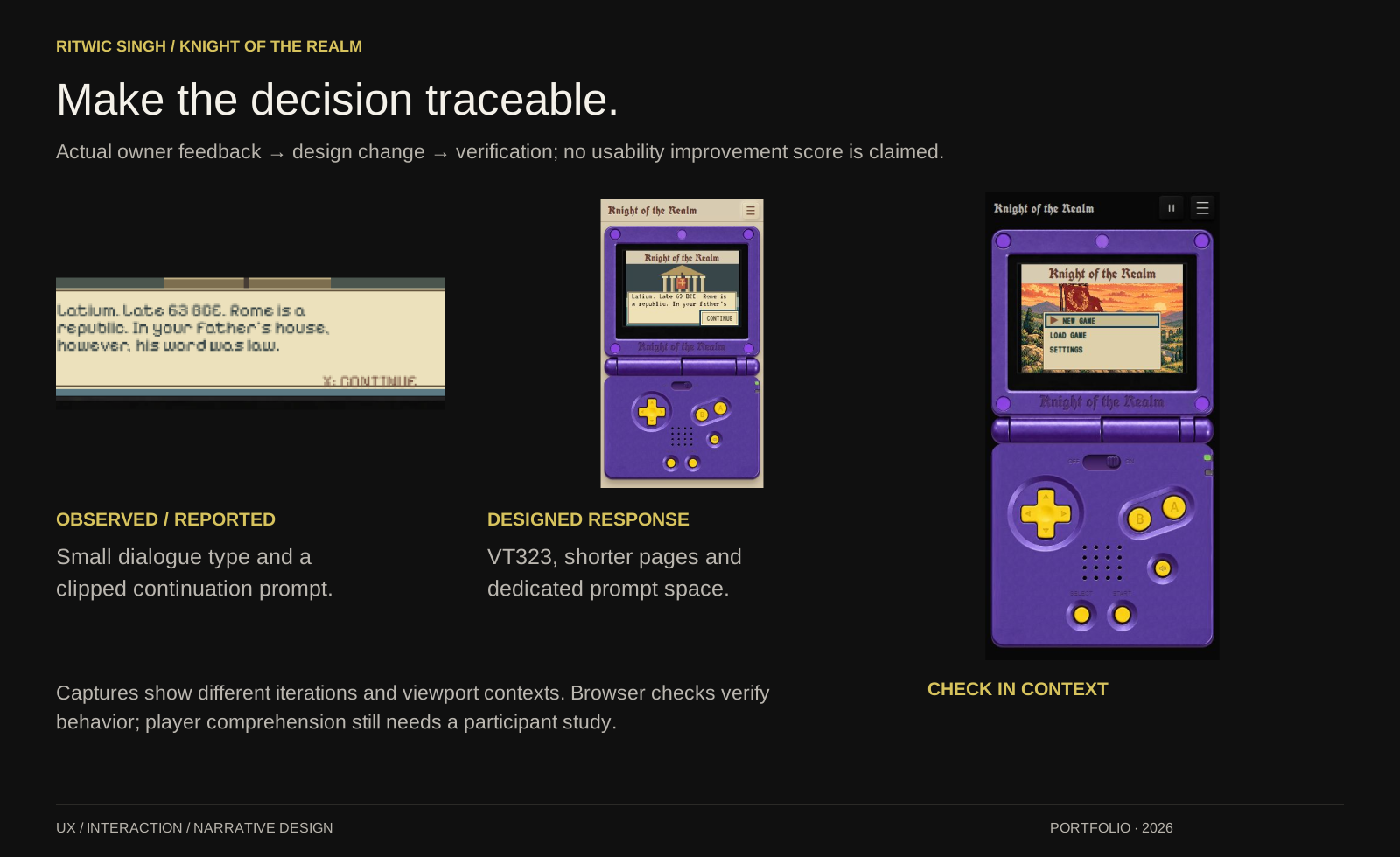
Feedback from an iPhone 13 exposed problems that a polished desktop screenshot could hide. I treated those reports as specific design problems, then checked the resulting behavior in the working prototype.
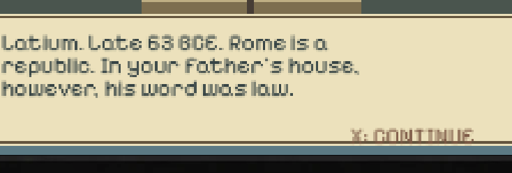
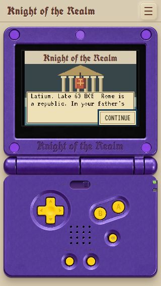
The captures document different iterations and viewport contexts; they are not a controlled comparison of reading performance.
Change: synchronize the slider, power lamp and game state; support both taps and drags.
Check: power off/on and orientation changes preserved the temporary journey’s position. Mute activated once per completed press.
Change: suppress selection, callouts and tap highlights on game surfaces while keeping real fields editable.
Check: browser input and release paths were exercised. Physical Safari long-press and cancellation remain device acceptance checks.
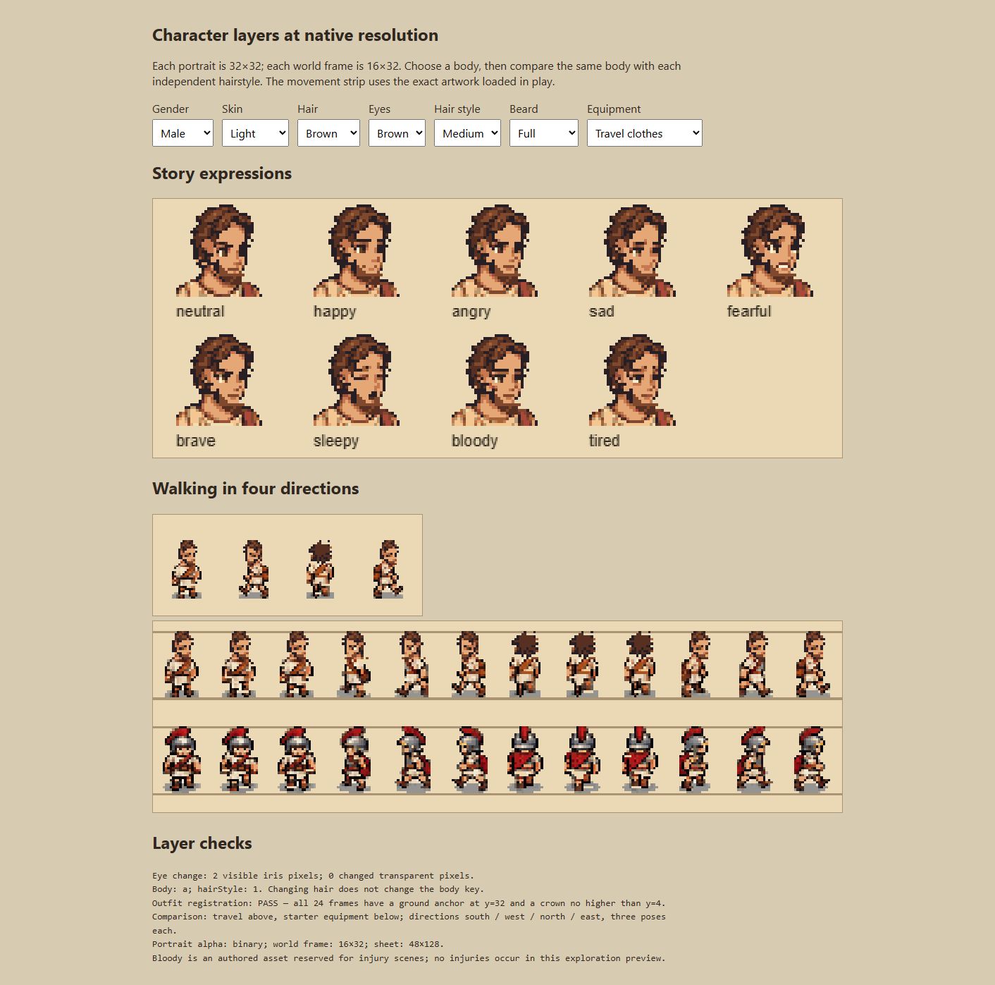
Change: separate hair from body selection, register eyes and beards to the face, and align both outfits to a shared ground anchor.
Check: 216 outfit frames were checked for registration; native asset checks covered masks, dimensions and expressions.
The premise follows a disowned aristocrat near Ostia in late 63 BCE. I developed the wider rescue story, character relationships and world itinerary, then narrowed the playable milestone to the opening investigation.
The first journey connects household tension, Livia’s dialogue, Titus’s forge and clues along the northern road. Dialogue choices, expressions and the journal keep the player’s immediate purpose visible without exposing the whole campaign at once.
Seeks family approval, then responsibility. Player-selected appearance and expressions connect the portrait to story beats.
A resourceful household provider. Dry, precise dialogue and a warm but tired expression establish the relationship.
Protective of his sister and skeptical of the hero. An expressive face and forge setting make that tension legible.
These authored character profiles are distinct from the player proto-personas above. Motivation, relationships and expression connect the narrative to moment-to-moment interaction.
09 / COMPARE, CHOOSE, REFINE
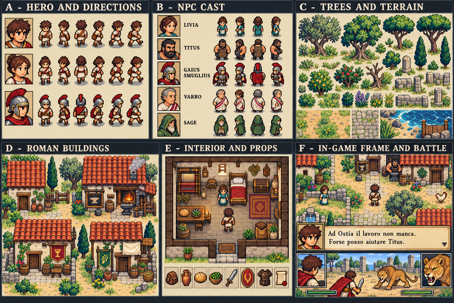
I compared character, environment and opening directions against a consistent 16-bit visual language. An early cinematic direction felt wrong for the game. The revised concepts returned to the approved pixel-art reference, native proportions and restrained palettes.
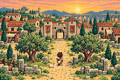
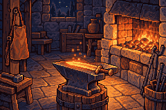
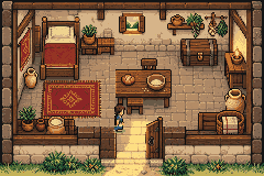
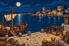
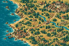
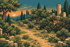


Previews start only when requested. One preview plays at a time.
The chosen opening was refined around a waving flag, a straight bridge and reflections confined to the river. Wind carries grass and dust without adding sparkle across the scene. It repeats through the title and prologue, then freezes at character creation. Pause and reduced-motion behavior give the player control.
10 / INCLUSIVE DESIGN & RESPONSIVE ERGONOMICS
A fixed pixel canvas and a hardware metaphor create practical constraints. The design pairs the expressive console with readable controls, alternative input and a reflowing Reading view. Desktop visitors get the landscape console; phone visitors get the portrait console.
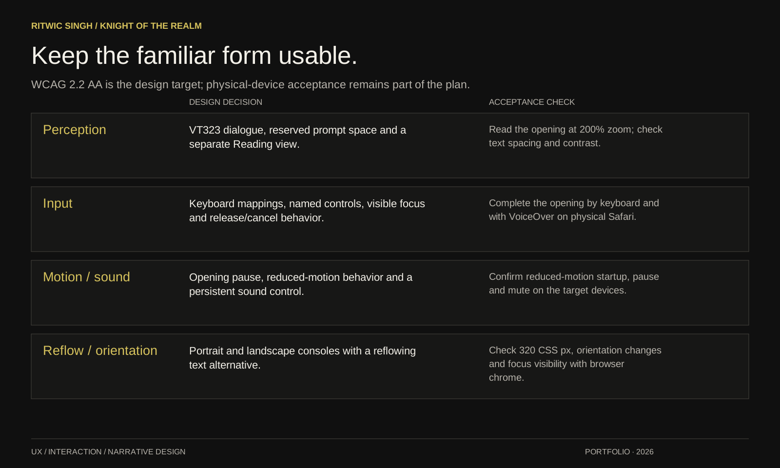
Design: VT323 dialogue, reserved prompt space and a separate Reading view.
Acceptance: Read the opening at 200% zoom; check text spacing and contrast.
Design: Keyboard mappings, named controls, visible focus and release/cancel behavior.
Acceptance: Complete the opening by keyboard and with VoiceOver on physical Safari.
Design: Opening pause, reduced-motion behavior and a persistent sound control.
Acceptance: Confirm reduced-motion startup, pause and mute on the target devices.
Design: Portrait and landscape consoles with a reflowing text alternative.
Acceptance: Check 320 CSS px, orientation changes and focus visibility with browser chrome.
Full conformance is not claimed. Physical Safari, VoiceOver, browser zoom and text-spacing acceptance remain. The design also treats native iPhone haptics as future work rather than relying on an unavailable browser effect.
11 / VALIDATION, PRIORITIES & REFLECTION
I kept feedback, design choices and verification records together so each revision could be assessed against the behavior it was meant to improve.
iPhone 13 screenshots and direct review identified power-state confusion, clipped prompts, selection highlights and casing defects.
Qualitative feedback · no participant study claimedPower, Settings, creation, dialogue, movement, journal, pause/resume and rotation were exercised. Six phone-sized viewports checked control bounds and proportions.
Browser checks · physical Safari acceptance remainsTwelve regression tests covered saves, progress, movement, cosmetics, input mappings and haptics logic. Asset checks covered native masks and aligned outfit frames.
Implementation evidence · not a usability scoreWCAG 2.2 AA guided contrast, visible focus, named controls, pointer cancellation, reduced motion and a reflowing Reading view. Physical Safari, VoiceOver, zoom and text-spacing checks remain necessary before claiming full conformance.
Proposed moderated tasks turn the persona assumptions into questions that can be tested. Observe task completion, hesitation, unintended inputs and how players explain the next step; use those observations to prioritize the next revision.
This is a validation plan, not a completed participant study. Physical-device acceptance steps are included in the downloadable project package.
The physical impression depends on a chain of small agreements: what a control looks like, how it moves, when it commits an action and how the game acknowledges it. Testing made breaks in that chain visible.
Further physical-device validation, refinement of the character art and expansion of the story. Combat, the full campaign and native mobile builds are future work.
12 / VISUAL PROCESS LIBRARY
Open or download the visual boards to inspect the process. Each map has a readable text equivalent in its section above.
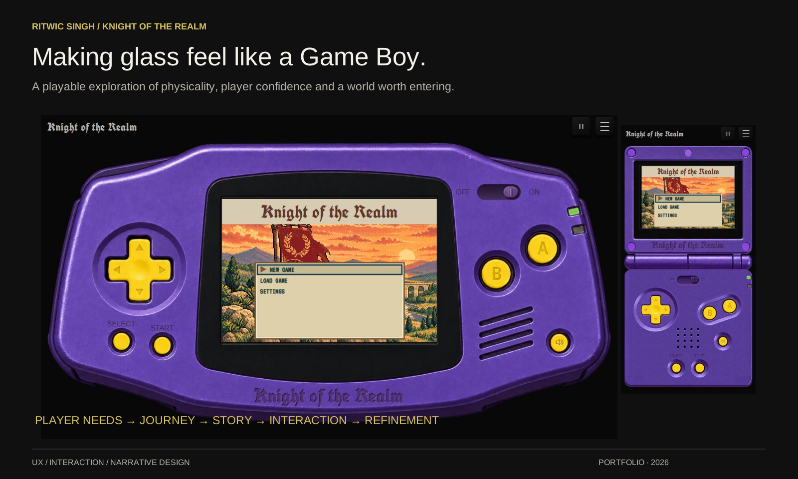 Making glass feel like a Game Boy. Three player lenses. Concrete design responses. From curiosity to a reason to keep playing. Six beats turn the premise into an experience. One control. A complete feedback loop. Separate play, progress and page-level tasks. Keep the familiar form usable. Make the decision traceable.